Overview:
- In a vertical bar chart, the X-axis displays the categories and the Y-axis displays the frequencies or percentage of the variable corresponding to the categories.
- Calling the bar() function on the plot member of a pandas.Series instance, plots a vertical bar chart. In the same way, to plot a bar chart for a DataFrame, the bar() function can be invoked on the plot member of a pandas DataFrame instance.
- A horizontal bar chart for the series data can be plotted using the barh() function of Series.plot member.
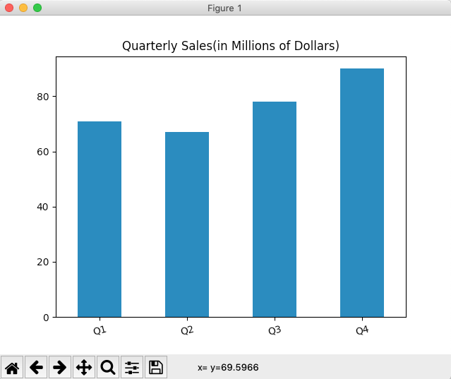
Example - Drawing a Vertical Bar Chart for the data in a pandas Series:
|
# Example Python program to draw a vertical bar chart from a Pandas Series import pandas as pds import matplotlib.pyplot as plt
# Create a pandas Series object ser = pds.Series([71, 67, 78, 90], index=("Q1","Q2","Q3","Q4"));
# Draw the bar chart ser.plot.bar(rot=15, title="Quarterly Sales(in Millions of Dollars)"); plt.show(block=True); |
Output:
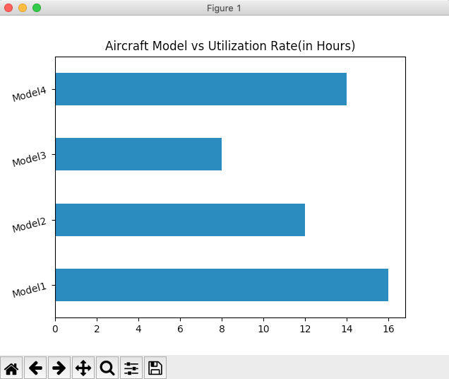
Example - Drawing a Horizontal Bar Chart for the data from a pandas Series:
|
# Example Python program to draw a horizontal bar chart # for the data present in Pandas Series import pandas as pds import matplotlib.pyplot as plt
# Create a pandas Series object utlizationRate = [16, 12, 8, 14] series = pds.Series(utlizationRate, index=("Model1", "Model2", "Model3", "Model4"));
# Draw the bar chart series.plot.barh(rot=15, title="Aircraft Model vs Utilization Rate(in Hours)"); plt.show(block=True); |
Output: